Fit Finder
Book any class, any gym, any time

Overview
Each of us has a unique relationship with fitness, and we each define it differently. In this project, I took a deep dive into fitness enthusiast Jack's relationship, resulting in Fit Finder - a simple mobile concept where fitness enthusiasts of all levels and interests can find and book group classes.
The goal of this project was to interview my partner Jack and explore his relationship with fitness, designing an app based my findings.
Concept Project
Role & Duration
User Interviews, Experience Mapping, User Flows, Information Architecture, Wireframes, Usability Testing, Branding, Visual Design
Solo Project
Timeline: 2 weeks
The Problem
This project took a deep dive into my subject’s attitudes and behaviors surrounding fitness. In exploratory interviews with Jack, I uncovered his love of fitness and how his relationship has changed with it over time. At young age, he enjoyed the competitiveness of team sports and focused on intensive strength training. As he ages, his needs have evolved. He still loves exercise, but he's looking for lower impact classes and values group training for the extrinsic motivation it provides.
However, he doesn't want to be tied down to a single gym and likes trying a variety of classes. With all of the fitness options available in London, how easy is it to find a convenient, high quality class to try?
Jack's Perspectives
"What does fitness mean to you?" Starting with this question, I conducted several interviews with Jack, exploring his feelings about and experiences with fitness. I dove into his behaviors and motivations, gains and pains.

GAINS
"Physical activity makes me feel brilliant."

MOTIVATIONS
"I like classes because I like to do something new, have something shown to me and mix it up."

PAINS
"I'm going online, texting someone, going on class pass. There is no easy way to find classes to try."
An Emotional Journey
Taking a closer look at Jack's last experience booking a group class, breaking down the tasks and the emotions throughout, painted a full picture of his journey. It was filled with highs and lows and one key opportunity - helping Jack in the class search process.
Jack needs a better way to book fitness classes because he is frustrated by how difficult and time-consuming it is finding new classes to try.

Fig 1. Jack's emotional journey booking a fitness class
Design Process
With a clear idea of Jack's pains, gains and motivations, I launched into an iterative design process to develop a meaningful solution.
I used a mini design studio session to quickly sketch out some ideas of how I could solve the problem of finding new classes to try. Selecting one of those ideas, I storyboarded the problem and solution, bringing life to the concept and why it was useful to Jack.
Understanding the user's steps through the app was essential in designing the solution.
While the core user journey did not change in the project, testing revealed heavy cognitive load in some parts of the flow. Testing also revealed some inefficiencies in the journey. Using annotations on each iteration, I refined the design to high fidelity.
Building a brand and style guide was a fun but challenging part of the project. I wanted to bring in the fun and joy Jack feels when working out. I used colors evocative of fitness gear. With a goal of making fitness fun and accessible to anyone, I opted for neutral icons instead of photography.
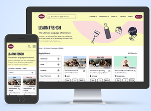
The Solution
A mobile app where people can tailor their next fitness class experience. Keeping the solution simple and accessible, fitness enthusiasts of all kinds can book any class, any gym, any time.
Project Learnings
Balance between simple and usable.
While simplicity should always be top of mind, I learned that over simplicity can detract from usability. A designer must find the right balance. In trying to keep the flow simple, I overwhelmed users with information overload. Users needed information fed in smaller chunks and the flow broken into smaller steps.
Context matters.
What I enjoyed most in this project was seeing how people react to a prototype based on context. User reactions and expectations morphed between paper and digital prototypes. Paper prototypes are great to test initial concepts and flows. Going digital really gets to the meat of usability insights.
More Projects
Obby Marketplace Redesign

Team Up Mobile Concept

Take Note E-Commerce Concept